Assignment: Take a magazine, newspaper or book that includes images and text. Lay tracing paper over the top of three spreads (both left-hand and right-hand pages). Using a pencil and ruler, carefully trace the grid underlying the page layouts. Remember to remove specific text elements or images, and to only draw the grid lines. Note column widths and margin sizes at the top, bottom, and to the left and right of the main body of text. Is your document based on a two-column, three-column, or another type of grid? Which elements stay the same on each page, and which change?
I decided to use an interior magazine and see how the layout and grids were used in the design. Down below you can see the magazine and the three spreads I used to trace my grids. I used both left and right pages in the magazine to see if that brought some difference.
Using tracing paper, I layed it over the different pages and started tracing out the layout. The design layouts definetly had a similar grid. All the pages used a three collum grid with different slight variations. As you can see the grids have the same layout that creates a grid for the text, but leaves freedom and creativity when placing images and different icons. There were also slight variations on the measurements and the small grids along the sides where headers and negative space would be.
Assignment: Compare the design (in terms of pace and contrast) of an online magazine, blog or website to that of a printed magazine, book or journal.
The differences between digital and print are pretty interesting and something that is very actual in the time we live in. A lot of readers see things online today and it can be very important to know the pros and cons of the different formats. Let’s talk about the findings I found when researching.
If you look at a printed magazine you will always notice a front and back cover. Unlike printed editions, digital online designs usually don’t have an «end» page. Instead of a front cover the online design usually have a home page instead.
In printed designs you have a content list in the beginning of the read, while digital designs often have a main menu and sub menus allowing the reader to jump around aimlessly. This can be both positive and negative. It is a very positive thing because it makes it more interactive for the reader, but at the same time it can be harder to get the reader to see all of the content you want to get across. This can be easier in a printed design where the reader will most likely flip all the pages and skim over the content until the end.
Printed designs can be very focused and can concentrate on showing the reader beautiful pictures and guiding them through text. Designs online can be filled with a lot of distractions like ads, and display banners that can distract the reader from the content that is trying to be portrayed.
Online designs also show plenty of appealing visual aspects to keep the reader interested and entertained. Online you also have the opportunity to have animations and illustrations with interactions making it more eventful for the reader as well.
Online designs also have an advantage because they can update the desing and content 24/7. It is also available for the reader to read every hour of every day. This can be a huge positive thing for the potential company and the reader as well. Unlike digital design, the printed editions have new issues every week that the reader have to wait for and then buy at the nearest store that sells it.
Assignment: Rearrange shapes cut out of paper, and try to find the point at which the figure disappears into the ground.
Cut out a series of shapes from black paper – squares, rectangles, circles and random shapes – in a variety of sizes, from small to large.
Working with a square piece of white paper, place shapes of different sizes into the white space; place them on the white one at a time and move them around.
Try to find the point where the distinction between figure and ground becomes unclear. Does it depend on which shape dominates the space: black or white? Is it about the position of the shape within the space? Think about how important figure-ground relationships are within composition and design.
I started the whole learning assignment by cutting out different shapes out of black paper. I did different shapes like triangles, squares, rectangles and circles. Taking a square white paper I started placing one and one shape on the paper. I didn’t have a specific plan when placing the shapes, but rather experimented different options when placing them. Here is my a visual of my step to step process:
I found that i had to place a lot of my shapes before getting the feeling of the figures blending together. I think it would help if it was placed on a black background because then you couldn’t see the end of the black shapes on the corners. The end result reminds me of animals, maybe specifically kengaroos on both sides. I did have some trouble creating the effect that was asked of in the assignment, but i feel like the end results I got created a feeling of form and space.
Assignment: Take five pictures every day for the next five days. The subjects of your pictures can include a series of different objects, people and landscapes. Apply the manual settings as explained in your textbook. Submit your six best pictures at the end of the week, listing the following with each picture: – ISO – Aperture – Shutter speed
It will be to your advantage if some of your pictures showcase motion blur and depth of field. In other words, I would like to see that you’ve experimented with the different exposure settings that were discussed in this module.
ISO: 200 Aperture: f 5.6 Shutter Speed: 1/80 ISO: 100 Aperture: f 5 Shutter Speed: 1/125ISO: 300 Aperture: f 8 Shutter Speed: 30″ISO: 100 Aperture: f 10 Shutter Speed: 20″ISO: 3200 Aperture: f 7 Shutter Speed: 1/50ISO: 100 Aperture: f 5 Shutter Speed: 0 » 5
After reading the appropriate section in your prescribed textbook From Snapshots to Great Shots, please answer the following questions:
Name all the functions / buttons on the front of your camera
Name all the functions / buttons on the back of your camera
Explain how you would set the correct ISO
Explain how you would change the aperture
Explain how you would change the shutter speed
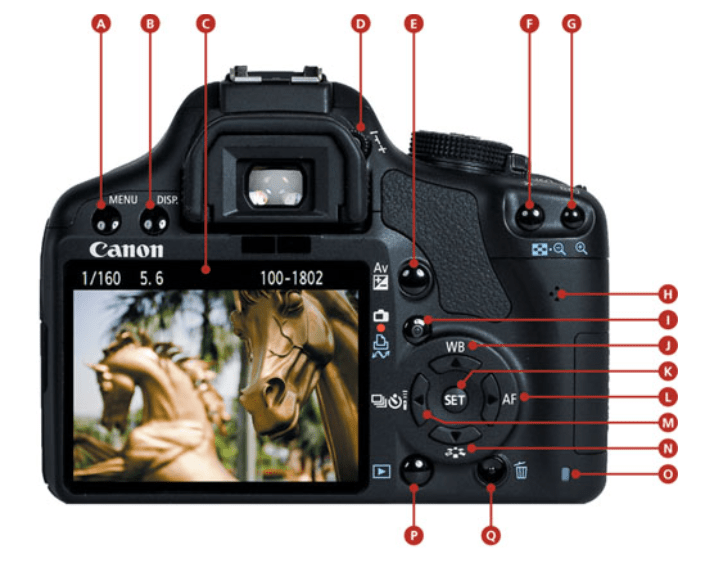
The easiest way to understand where the different sections are is with a visual map, so here is an image of my camera that shows the functions.
Front of the Canon camera
You can find a list with explanations below
A. Menu
B. Display
C. Rear LCD
D. Dioptric Adjustment
E. Aperture/ exposure compensation
F. AE/AF Lock/ Focus/ Reduce Image
G. Focus point selection / Enlarge Image
H. Speaker
I. Live View/ Moving Shooting
J. White balance/ Up Cross Key
K. Set
L. Autofocus Selection/ Right Cross Key
M. Drive Mode Selection/ Left Cross Key
N. Picture Style/ Down Cross Key
O. Card Busy
P. Image Review
Q. Trash
Correct ISO
The biggest reason to change the ISO setting is to adjust how fast the camera shoots images. The faster your camera ISO, the faster your shutter speed and your images will look sharp. When you get to shoot an image quicker with the ISO there is less chance of unwanted blur and freezing the image in an instant. The ISO setting determines how sensetive the camera sensor is to light. So the higher ISO setting, the more sensetive it is to light and takes the shot faster. Setting the ISO should be a mix between speed and photo quality. If you choose a ISO that is too high you will notice that the image is grainy in high resolution, therefor it’s important to weight up the available light and then set the lowest possible ISO setting that shoots quick enough to not make the image blurry.
Aperture
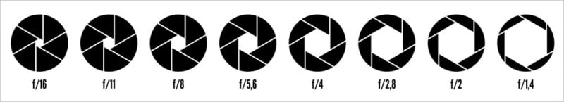
The aperture refers to the size of the opening in the lens of the camera. The size of the opening can be adjusted and the aperture size is measured in f-stops. This controls how much lights get through the camera lense. When you change the f-stop value, you change size of the opening. The higher the f-stops, the smaller the opening. If you use a wide aperture, the depht of field will be shallow. This means only part of the image is going to be sharp and the rest will be out of focus/blurred. Below you can see an illustration of the different f-stop values and how the lense works with it.
Shutter Speed
The shutter speed refers to the lenght of the time the opening of the lens remains open to let the light into the camera and the sensor. The shutter speed can be as fast as 1/10,000 of a second or as slow as several minutes. A faster shutting speed has the ability to freeze motion in the scene you are photographing. Slow shutter speeds will blur motion in the scene and both of these effects can be used creatively while photographing. Shutter speed can be a great use especially while shooting water in motion.
Assignment: Throughout this lesson you’ve learnt about the various techniques used and inventors that contributed to the art form that is Photography. Choose only one, do some additional research and in your own words write a report on why you think the chosen technique contributed to what we are able to do today through photography.
Here you can read my report further explaining the history of the Kodak Camera:
There has been a lot of progress and evolution through the history of photography. In the early history, a lot of people used kitchen chemestry because they didn’t have photographic studios everywhere. There was a lot of experimentation of different chemicals that were used to create images.
Through the evolution it was created over 150 different photographic processes in less then 200 years. If you didn’t know what you had, you had to base it off something someone previously told you. They didn’t know how to exhibit it, dislpay it, conseve it or store it without causing damage to the image itself. That’s why there had to be a lot of trial and error before they found something that eventually worked.
This is what we’ve been learning about this week and here’s the first assignment: Pick three events in the timeline from this week’s lesson History of Photography: An Introduction, and find photographs of the event on the Internet or in the library and write a paragraph explaining the event in more detail. Include your photographs in the description
Photogenic Drawing
William Henry Fox Talbot was an English chemist, linguist, archaeologist and pioneer photographer. He had published many articles about these fields, but in 1835 he published his first article documenting his photographic discovery, of the paper negative.
These «Photographic drawings» were basically contact prints on light-sensitive paper. This method used a lenghty exposure time to create the image of the object. These first photogentic drawings were obtained through direct contact with flat objects like plants, fabrics, drawings and manuscripts. Here’s the process it took to create an image:
Paper is first soaked in a weak brine solution and dried
An insoluble light-sensitive layer is then deposited on the paper by treating it with a strong solution of silver nitrate.
The subject to be captured is then held in place against the paper by a pane of glass and exposed to sunlight. In his experiments he made use of a leaf as the subject. The areas of the paper not covered by the subject darkened.
The images were then fixed by washing the images in a salt solution. This had the effect of making the unexposed silver compounds light-sensitive.
The Camera Obscura
The Camera Obscura can be described as a dark room or a box with a little opening in the side. You could use this technique in a room, box or a tent and create the effect. This technique uses light rays passing through the little opening on the side that are projected on the opposite side of the room to form an image of the object outside of the «darkroom». This made it possible to draw the image shown on the wall with pencil and making it more realistic. It was invented by the scientist, mathematician, astronomer and philosopher, Ibn al-Haytham.
The Camera Obscura was used a lot to study eclipses without the risk of damaging the eyes of the person looking at the sun directly. It was also a big drawing aid, because it allowed the artist to trace the projected image and produce a highly accurate representation of the object. This made it much easier to create a proper graphical perspective.
As you can see in the picture above the image from the outside turned upside down because of how much the light reflected around the dark room, so later they improved the camera obscura and used mirrors to make the image appear the right way they wanted to. Through the years they alsocreated smaller versions of dark rooms in boxes instead of literal rooms or tents.
The Kodak Camera
In 1888 George Eastman invented roll film, then brought forth the Kodak camera and changed the entire face of photography forever. The Kodak camera was a lightweight camera that was distributed as a easy camera yo use with the slogan «you press the butten, we do the rest». The tiny camera had a focused lens and caught the attention of many consumers. With the camera he brought the filmroll and created the opportunity for everyone to take photographs and document their lives.
The camera was preloaded with anough roll for 100 pictures and when the consumer had used the roll they would send it to the factory and get prints made of their photographs. This created a new fun way to keep memories and creating a photographic notebook for everyone who wanted.
The Original Kodak was fitted with a rotating barrel shutter unique to this model. The shutter was set by pulling up a string on top of the camera and operated by pushing a button on the side of the camera.After taking a photograph, a key on top of the camera was used to wind the film onto the next frame. There is no viewfinder on the camera; instead two V shaped lines on the top of the camera leather are intended to aid aiming the camera at the subject.
The last learning assignment for this week was to create a book cover for one out of three options. All the options had different names, authors and specific colours we had to use to create emotions in our design. The book option I decided to make a design for went like this:
«The Secret Garden» by Frances Hodgson Burnett: Use secondary colours to express naivety, honesty and harmony.
I was really excited for this task, but it also ended up being the hardest part of this weeks assignments. This assignment took a lot of time to just figure out the design I wanted to make. I created a bunch of sketches and ideas that I didn’t end up using for my finished design. Here are some of the rough sketches I created in my brainstorming sessions.
I did a lot of sketching and felt a bit stuck in my brainstorming process about how I wanted the layout of the design to be. This made me forget all my previous ideas and start fresh. That’s when I created my finished book cover design that you can see in the first picture. One of the specifications in my task was to use secondary colours (green, orange, purple) and use them to express naivety, harmony and honesty.
Green was a great colour to create harmony as it already is a very calming colour that represents growth and the earth in itself. Using orange and purple gave the design a pop of colour and created a nice atmosphere in the illustrated garden. I used lighter versions of the colours to keep the design naive and peaceful.
In this assignment we were going to use a coloured image of our own choice and use photoshop to create different effects on the image. This was also a part of colour theory and learning about different colour effects we can use on photos to give them the emotion we want to portray.
I decided to use a coloured image from my own photos for this assignment. It was a little tricky getting the effects right in the beginning, but I got the hang of it after creating the first colour effect. This was also my first time using photoshop this way so it was a fun opportunity to get the ball rolling. Here are the different colour effects!
When we are designing different ideas and illustration, colours play a very important part. Colours can be used to express different meanings and emotions in different designs. This week our main subject has been colour theory and understanding different schemes and effects colours can have.
We also have colour systems that we’ve had the opportunity of trying out the last couple of weeks. The two colour systems we’ve been using are RGB and CMYK. It can be hard to know what these mean from just the names, so here’s a quick explanation.
RGB: stands for (red, green, blue) and is a colour system that combines these colours together in the design. This system is used for light (not pigment) so the colours in your design grow brighter as you blend/increase the intensity. It basically adds the primary colours together, blending them with light, making your original colours pop and look brighter.
CMYK: stands for (Cyan, Magneta, Yellow, Black) and is a colour system used especially when printing colour images. Unlike RGB this system gets darker as you blend it together. It uses the four basic printing colours and that’s why it’s used for printing mostly. This colour system is «subtractive» making the colours darker when blending, while RGB is «additive» making the colours brighter.
Another part of understanding colour theory was making different colour schemes and learning about them. Here we had to use adobe colour and create four different colour schemes and show them on our blog. Here are the different schemes and how they work.
Analogous Colour Scheme
The analogous colour scheme has colours next to each other on the colour wheel. In this scheme the colours have similar features, functions and are comparable to one another.
Monochromatic Color Scheme
The monochromatic colour scheme is based on one single colour tint. It shows the colours variations in shades of the same hue. It is altering saturation and brightness of the base colour.
Complementary Colour Scheme
The complementary colour scheme is using one base colour and it’s compliment (the colour on the exact opposite side of the colour wheel). Here the base colour is dominant and the complimentary colors are used as accent. This colour scheme creates a combination of warm and cold colours together.
Triadic Colour Scheme
The triadic colour scheme uses three colours evenly spaced on the colour wheel. One of the most basic triadic pallettes are the primary colours red, blue and yellow and the secondary hues orange, purple and green.
This was some of the basic colour theory we’ve learned this week, with many more lessons to come!