The last learning assignment for this week was to create a gig poster for the band «The Keystrokes». I had a ton of fun with this assignment and got to explore creatively with many options. We didn’t get any specifications about genre or the vibe of the band, so the possibilities were open for anything.
Finished gig poster design
When I was making the gig poster for the band I had an electronic music band in mind. I really liked the concept of using neon lights/effects in the design and wanted to incorporate it in the poster. As you can see above I udes a one line design and duplicated it to create the neon sign look. Another part of the assignment was to extend our design and make a tour pamphlet with more information about tour dates, merchandise etc.
Tour pamphlet design
An important part when making the pamphlet design was to keep the same theme going. The gig poster and the tour pamphlet were supposed to be connected in their theme. I kept the same fonts and colors going through the pamphlet. Keeping the neon affects and the face symbol on the first page helped connecting the two designs together. This is a pamphlet designed with the option of folding it as well.
Inspiration posters
Here are some of the posters that I really liked and inspired me in the beginning of my design brainstorming. When I first started thinking about ideas I was considering the band to be a jazz band. So when I was brainstorming in the beginning that was my initial thought. But as I was looking through different poster designs I came over the retro VHS design and the neon light text effect. These designs made my mind go in another direction when making the poster.
At this stage I knew I wanted to have neon effects in my design. I wanted the band to have a modern, funky, electric vibe when looking at the poster. I recently got a continous line tattoo and figured a design like that would fit nicely in the neon concept. I looked through pinterest at different continous line faces and found one I really liked for my poster.
Different design concept for a jazz band
Sketching out the face I liked
Brainstorming tour names for the band
After I had sketched out the continous line face design I went to the computer, opened illustrator and started designing it digitally. The first thing I did was to make the face design I was going to have as a main symbol on my poster. I was expecting to have a lot more trouble with designing it, but after planning my lines it went surprisingly well.
First look at the face line design
When making the neon effect on my design I searched youtube to look at how to make this happen. This helped me out a lot when creating the design. When I was making the type on the design I just had to check out different fonts to see what would look the best with the neon concept. I kept the font for the rest of the information more basic in contrast to the main font. I kept the design simple with the three colors white, blue and orange. This also made the different information texts pop when using different colors to highlight them. The black background also helped making the colors pop as well and fit perfectly to the neon concept.
I had so much fun with this assignment and really enjoyed making the design. I love concerts and music so it was a great experience trying to design a gig poster myself. Excited for next week!
This week was all about understanding typography and how to use it when designing. To better understand the different anatomy concept in typeface we had to create a visual typography anatomy design describing the different concepts. Here is the visual explanation I created with some of the typeface anatomy concepts.
For this design I didn’t do any paper sketching before designing digitally. I had an idea in mind and felt it was ready for being created on the computer. I started with the background and meassuring all the lines and squares. I made the design step by step, adding the circles, letters and lastly the explanations beneath. Adding the blue sections on the letters made it easier to understand what the explanation below is telling the reader.
First assignment of this week was to design a word design that expresses its meaning, but still using only letters. The designs were only to be made in black and white as well. Here are the designs I created for the assignment this week.
Made up word, meaning how things are looped together.
Loading design created as a loading sign.
Elevate design showing how the word elevates and disappears. Created the word only using seperate letters.
When I was going to make these three designs I had to do some sketching. It was also important to do some font tests on the computer to see how the different fonts operated. Below you can see some of my sketches for the different designs and tests I did.
Another one of this weeks learning assignments was to look at a logo and analyze which parts of the gestalt principles are used in the design. These principles consists of different design methods you can use that explain how you can place elements together and apart to make the design more striking and eye catching for a bystander. Here are some of the different principles explained with text and a visual example.
These law principles were created by psychologists Max Wertheimer, Kurt koffka and Wolgang Kohler who wanted to understand how humans typically gain meaningful perceptions when there’s a chaotic stimuli around them. They made a set of laws that were going to adress this natural compulsion for the brain to seek order and disorder. This makes the eye see a series og elements as an image or an illusion. These laws and principles shows how our brains create structure by default.
«Gestalt Principles is a set of laws arising from the 1920’s psychology, describing how humans see objects by grouping similar elements, recognizing patterns and simplifying complex images.»
Wolfgang Kohler
It is a powerful but a natural trick to use in the design industry. It focuses on perspective and design standards. Graphic designers have used these principles as methods in advertisment and encapsulating company values in iconic logos. Today there’s a lot of designers that use these different principles when they are designing new logos for different brands and companies. If you take a closer look at some logos you will notice how they’ve been made with well placed elements that catch the eye.
In this assignment we were supposed to examine this specific logo and explain what gestalt principles we feel is used in the making of the logo. Before I go into what principles I think this logo has i’m going to first describe first thing I thought the design of the logo. The first thing I noticed about the logo was the hidden U shape in the design. The logo consists of one color making it have a simple and clean look, but there’s a lot of design elements created of small visuals making it more interesting. The way the logo is designed with round edges gives it a calm and flowy feeling.
Gestalt Principles in the design
When I was looking over the principles and considering what this logo has of it, I found many possibles design principles used, but here is the three principles I think stands out.
The first thing I noticed when looking at the logo was how the designer had created the U shape. I consider this to be a use of the «closure» principle in the design. When we look at the arrangement of the elements, we look for one recognizable pattern. In this design the designer has arranged the different visual nature elements so it’s tricks the eye to see a U shape. With this design the brain automatically fills the missing parts to create the rest of the visual.
I think another design principle used in this logo is the «common region». You can see an example of this in the design when you look at the proximity of the visual elements together. The visual objects are put together within the same closed region, so we percieve them as being grouped together, instead of apart. This is also a factor of how the U shape is visualized so well in this design. Something I really appreciate about all the elements in the logo is that every little element has a significant meaning to the company.
The last principle I feel stands out in the logo design is «Continuity». If you look at the logo name there’s a nice font that makes the lines of the letters flow together. The designer used the same color on the logo and the brand name making them seem whole and connectied. The design also has the same flowy design with soft edges on all the elements including the name, making them feel even more connected as a whole.
Remaking the Logo Design
The next step of the assignment was to take the original logo design, choose the principles you want to use and create three new logos for the company using them. For me to be able to make new logo designs for the company, but still stay true to their values and ideology, I had to do some research first. This was an important first step to finding good design ideas for that specific company.
When I first started this assignment I had no idea what Unilever was or what the company did. That’s why it was really surprising to realize that I see their product on a daily occurance. Unilever actually makes some of the best known brands in the world, you just don’t see their logo on every product. The company stands behind products like Ben&Jerry’s, Dove, Lipton, Magnum, Axe and many, many more.
Unilever is a transnational consumer goods company with headquarters in the United Kingdom and the Netherlands. The company products are food and beverages, cleaning agents, beauty product and personal care products. As you can see the company has a lot of products people use every day and today you can find their products in 190 countries around the world.
Something that is really important for the company and is promoted a lot on their website is «Sustainability». The company wants to make a sustainable living commonplace for it’s consumers. They describe this as the purpose for their buisness. The company has products from a range of 400 brands that gives them a unique place in peoples lives around the world. This makes it even more important for them to fulfil their company purpose.
«Whatever the brand, wherever it is bought, we’re working to ensure that it plays a part in helping fulfil our purpose as a business – making a sustainable living commonplace.
Taken from their website Unilever.com
Having this in mind I started sketching out some immidiate ideas for the designs. For the first logo design I really wanted to get across the partnership and friendship between brands and the consumers, which is the foundation of the company. The first thing that came to mind when thinking of these values were two hands holding each other in a helping manner. As you can see on my sketches below I started with two hands doing a handshake. This felt a little to formal and had a buisness front to the design that I didn’t like for the design concept.
Even though Unilever does buisness between the brands, I felt like it should feel more as teamwork and a mutual friendship when looking at the logo. Going online for some refrence hands I used the picture below as inspiration for my design. These hands have less of a formal look and generates trust and partnership. This fit the design concept I wanted to create and represent for the company.
These hands are illustrated in a realistic way, but I wanted to simplify them a lot and get the look of my first sketch instead. The idea I had in mind was to use the closure principle in the hands symbol Using negative space between the hands and fingers, using the white background as the rest of the image. With this principle the eye automaticly put the negative space together with the positive, creating the whole design.
Having an idea in mind and using the refrence I went straight to creating the design digitally. This process went relatively smooth but I did have to do some regulations with the negative space between the hands as I was designing it. It was important to create enough negative space between the elements to create the principle effect I wanted. I decided to include the company name, because I found that it completed the logo design nicely. I chose a bold, thick font with round edges representing stability and trust in the company and their partnership between brands.
Finished closure design for Unilever
For my next logo design I wanted to focus on the purpose of the buisness, the importance of sustainability. The whole idea behind sustainability is to give opportunity for growing and development for years to come, without damaging other things in the process. This was obviously an important thing for the company and something that defines them and their values.
That’s how I came to the idea to incorporate a growing plant in their company name. The growing plant represents sustainability, growth and evolution in the company. I sketched out their name on paper and tried changing the «i» in Unilever to a little plant. I really liked how it turned out and decided to develop the idea further. Here are the beginning sketches.
When I was designing the logo digitally I wanted to keep the theme of round edges as the original logo had. I really liked how it looked and made the company seem more friendly and «humane». In the process of making the design I only used blue for the logo. This looked nice, but didn’t make it stand out enough. Using the focal point principle really helped making the desing more distinct. The purpose behind this method was to make an area of interest that would catch peoples attention. Changing the color of the plant made the symbol more eye cathing and the logo as a whole more interesting. Here you can see the difference it made.
The design only using one color
The design with a focal point
Using the focal point principle really made the plant stand out in the design. This helps get the hidden concept across better and makes it more interesting for a bystander seeing it for the first time. Here is the finished logo design using the focal point principle.
For my last design I had some trouble choosing the principle I wanted to use, and how to use it in a design. Going through the different principles I decided I wanted to use the similarity principle. I didn’t do a lot of hand sketching for this one because I only used lettering in the design and it was more convenient to regulate different fonts digitally.
The way I used the similarity principle in this logo created a nice looking design, but it didn’t really say a lot about the company and the values behind it. I think it could fit really nice as a print, but not so much as a logo representing the company. Even so, it was a fun design to make.
Finished similarity design for Unilever
It was challanging to make three logo designs for the same company, but it really helped using the principles to spark some ideas. It was a really good learning experience and a great way tp practice making logo designs that gives a message to the audience. My favorite logo design was definitely the closure design with the hands together. I think it really represents and tells something about the company when you see it. The first thing that comes to mind when I look at it is stability, trust and teamwork.
I really liked the focal point design as well, but felt that the plant theme can be seen in a lot of enviromental companies already. I think that would make the logo not as unique in the big picture and may make people believe their an enviromental company. This factor made me even more sure about choosing the closure design as the chosen logo for Unilever. So for the last part of the assignment, here is the logo closure logo in a vector format.
More than ever, getting you’re brand out there and connecting with you’re cutomers through ideals is important. How you promote and show the identity and products of your company is a big part of how well it’s going to evolve. Today H&M is a well known global clothing company. They’re known for their fashion for both men, women and children. The company has gotten huge success on the fashion market, but they haven’t always been this big. Let’s take it back to the beginning.
Front of the H&M store in Narvik
The start of the evolution of H&M stores started in 1947 in Sweden. A swedish man named Erling Persson became the founder of the company when he opened the first ever H&M store in Sweden. At the time the name of the store was «hennes» and it only offered womens clothing. Ten years after the first store launched, Erling Persson bought the rights of the hunting store name «Mauritz Widforss» and changed the name of his own company to «Hennes & Mauritz» In addition to the name change, they also added the sale of mens and childrens clothing.
First store in Sweden
Through the years H&M has gained a lot of success and are now known all over the world. When this happened it was really important to have a brand identity element so people would recognize the company again another time. This is where their logo came in to save the day. They haven’t always had the same logo, very few companies have that, but all the logos have had a connection to each other.
If you look at the evolution of the H&M logos below you can see that the company hasn’t strayed far from each change that was happening. The H&M logo is a wordmark in my opinion. They use the first letters of the company name with a distinctive font as well. The logo font is a little cursive which is a noticable thing for the company. But the most distinctive part of their logo for me is the H. The way the line crosses over the H in the logo has been there from the very beginning. It is something customers find recognizable and connect it to the company in their memory.
Today the clothing company has opened stores all over the world and has gained an enormous success. They have branched out to other countries, expanding their company, customers and employees. Today they are a global company with thousands of colleagues, with many different backgrounds. With so many employees, it’s important that everyone has a shared value for the company and the ideology they want to get across. This is what the company calls «The H&M spirit»
On the H&M home page they explain how this is very important to them and the success of the company. They want all of their employees to have a fundamental respect for individuals and have a belief in their people. It’s important for everyone to rememeber the shared values of teamwork, simplicity, entrepreneurial, cost consciousness and openess. These are the same values as the ones founded at the very beginning by Erling Persson.
The first thing that comes to mind when I think of the brand ideal for H&M is «good fashion for a good price». The store always have a lot of sales and clothing with great prices for everyone. After researching the company and their brand values and ideals I found out that their concept is «Fashion and quality at the best price» As you can see the company has made me, as a customer, believe a pretty similar ideal as they want to represent.
H&M has the desire to give the customer the best possible fashion deal. As a customer myself, this is actually the store I go to for the best prices. They strive for constant improvement and the best combination of fashion, quality and price. The company describes that fashion, fun and action is essential for their stores.
I think the company does a pretty good job when marketing their product in the store. They have a lot of great marketing sections through the store that show the clothes. They do point out on their website that the advertising does not aim to portray any specific ideal, but rather a range of different style, attitude and ethnic background. In my opinion, I think they do show case a range of many different styles and outfits on their mannequins.
When I was going through the store I noticed how I got different vibes that fit their brand ideals. When you go through the kids and teens section you get a lot of «fun and action» that H&M feel is essential in their stores. As you can see in the pictures above, there is a lot of fun colors and styles showcased for the customer. The clothes have glitter, prints, patterns and fun colors so you can choose the style you like. In the teen section the clothes are trendy and up-to-date, different styles are shown and the prices are great.
When you walk through the womens section of the store you get a more elegant and simple range of styles shown to the customer. There is still different styles and attitudes displayed, but you still notice the change towards a more «grown up» fashion. I don’t say this as a critisism, actually more as a compliment. Sectioning the store like this makes it easier for the customer to find their style as well. The different sections target different age groups and customers.
Going through the mens section there’s a little darker and masculine theme. There are more black interior instead of white and they use wood elements as well. Here as well there is a pretty simple and clean marketing in the way the clothes are showcased. Another thing that the company strives for and find really important is to convey a positive image and that the models portray their fashion in a healthy manner. I didn’t see any conviction of an unhealthy image in the store and I think their mannequins give a positive image as well.
The company has also expressed that they want to «keep it simple» in their stores. You can see this well especially in the men and womens clothing sections. Another place this is shown really well is in the stores window displays. They didn’t have any mannequins in the windows, instead they chose to display two big pictures of models wearing their fashion, grabbing the attention of people walking by. H&M’s marketing has also said that the store windows and online stores are the most important to them when reaching customers.
Another thing the company expresses a great deal on their website is the important of sustainability. This was something that wasn’t shown in this store at all. If you want to know if the clothes are sustainable and good for the enviroment you’d have to check the label inside. I know that in other H&M store they do a good job of advertising and showing what is their sustainable options, but in this store there wasn’t any signs of that.
H&M has also announced how they want their campaigns to be clear and simple. The design is aimed to inform the customer with all the information they need in a simple way. On the picture above you can see one of their shampoo campaigns. They also want to have a marketing that is aimed to help the customer find their fashion and style. Having different styles and attitudes on their mannequins and marketing sections makes this goal and ideal possible for the company.
Taking everything into consideration I think H&M give a good customer experience according to their brand ideals. The clothes are well showcased both on hangers and the mannequins. They have signs fo the prices so it’s easy to see the good deal you’re getting as well. Each section of the store gives something new and comes with a new vibe. There’s something for everyone. The only thing that didn’t get showcased in the store was the sustainability options, which needs to be improved. I think H&M is going to continue to grow or at least stay as popular as they are now. The company continues to expand with H&M Home interior and different campaigns, so it won’t surprise me if they’re around for a long while.
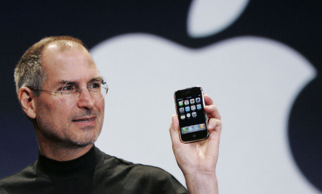
The evolution of the Iphone started with a request from Apple’s CEO, Steve Jobs. He wanted the engineers to start investigating the possible use of touchscreen devices and tablet computers. After a lot of testing they realized that it was possible to achieve these products, and in 2004 they tested the Iphone beta and it’s ability. This was only a test but in 2007 they released the first Iphone to the public.
They announced the news of the new phone and it’s ability to support a third party application on the Macworld confrence that year. Steve Jobs believed that phones were going to be very important devices when it came to portable information access. That’s why the company really focused on the Iphone to have an excellent synchronization software.
But before the Iphone came in 2007, Apple Inc had created a lot of success for themselves with other products as well. In 2001 they came out with Itunes in a partnership with ROKR, but in the beginning it was only available on the Ipod. Apple wanted to be true to their own ideas, so in 2006 they discontinued their partnership with ROKR.
Apple INC’s CEO Steve Jobs with the Iphone
The Ipod was released in 2001 and was a huge success for Apple before the Iphone came. It was a consumer favorite and they sold over 400 mill units. But Apple knew that the days were numbered when it came to the Ipod because of the new smartphones. Knowing that the smartphone would get music capacity created the death of the Ipod, but it was an important step for the company to evolve.
The year of the Iphone launch, Apple paid over 1 million dollars for the domain name Iphone.com. This was a really neccessary investment and even today that domain name is their home page. Apple wanted independence so they could create the phone they envisioned themselves. They had control over the design, manufacturing and marketing. Steve wanted to reinvent the phone and make it cheaper, faster, available in more countries, compatible for third party apps and more suited for buisness. That was his vision for how the Iphone would continue to evolve.
When apple was thinking of a name for the new smartphone, they had several ideas. They considered calling it «telepod» This was a new futuristic twist to the word telephone. They also considered calling it a «mobi» short for mobile. In the end they ended up with the name «Iphone» and it was the perfect continuation of the Ipod and later the Ipad.
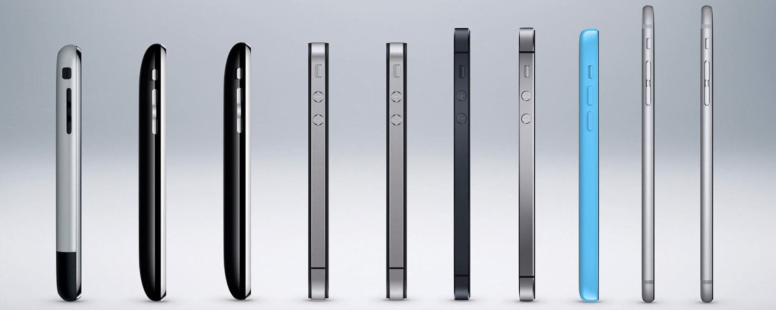
The evolution of the Iphone
Even the first Iphone was nearly all screen. Apple’s chief of design, Jonathan Ive was credited for the Iphones size, style, and shape. The week before the Iphone was released to the public, the Iphone actually had a hard plastic screen. Steve noticed how easily it got marks and scratches so he knew they had to change it right away. Apple was then part of a making a new, reinforced glass to have on the phone. The new glass was called Chemcor and could withstand 100,000 pounds per square inch. A normal glass could only withstand 7,000 pounds.
Since then Apple has added new features to the Iphone rapidly through the years. Even in the beginning the Iphone was truly unique with the touchscreen, email, web browsing, searching and maps. After that they also updated the visual voicemail. From 2007, the year the first Iphone came and until today Apple has released many new versions and new updates of the Iphone. In 2011 they updated the phone and added Siri and Icloud. The two years after that they also added the 4G LTE, new colors, slo mo camera, touch ID. In the years leading up to today they’ve released even more updates like Apple pay, no headphone jack, wireless charging, all screen phone, face ID and much more. Apple is always trying to make the Iphone better and the older models get discontinued regularly after two years because of this.
Apple set the tone for the smartphone market and brought a new era of personal computing devices. They changed mobile phone history when they made their gorgeous, easy-to-use interface for the Iphone. Today almost all the smartphones in the world are built using Apple’s design concept. When the Iphone first came it was revolutionary. It was small, light and easy to put in your pocket. In reality, the worlds first handheld computer. Today you see someone with an Iphone in their hand everywhere. Apple has had a huge success with all the Iphones and they’re forever evolving even better versions.
Iphones Brand Identity
As I see it, the Iphones brand identity is «Everything and beyond» Today you have everything you need on your phone and it has become a part of everyone’s lifestyle. There are endless of apps and possibilities when it comes to lifestyle planning, maps, interests, entertainment etc. The Iphone brand identity is connecting people together and also having the possibility of pretty much anything at the touch of a fingertip.
Today everything is online and being done digitally so you almost need the smartphone with you to keep up. This can also be overwhelming and addicting in some ways. The Iphone gives you a connection to the whole world in a second if you want it. That’s what makes it so intruiging to use. It also combines pleasure and neccessity. Having a calculater, maps, calender and notes on you at all time can always come in handy. That’s another identity for the brand. Making the consumers life easier and more convenient with the Iphone. The Iphone is a multi-purpose smartphone giving you an enormous access to the world at your fingertips.
Current Positioning
Today the Iphone is featured worldwide as the most popular smartphone for the consumers. Out of all the smartphones sold in the world Apple profits 80% of the units. This means that almost all the other companies lose a little money for each smartphone they sell. This only shows how popular and successful the Apple company is with the Iphone.
Apple has positioned itself as a stylish, easy-going, cool, innovative, casual and a friendly brand. The brand has consumers with a big age gap as well, but their products can offer each consumer what they’re searching for. The company focuses a lot on peoples emotions, lifestyle, imagination, passion, hope, dreams and aspiration. Since their product is so consumer friendly for everyone, it’s up to the people how they want to fulfill the purpose of the Iphone. I think Apple wants to make people’s lives easier and have a genuine connection to their customers as well.
Strategy behind the Iphone
I think the strategy when making the Iphone was first to just test if it was possible. They did a lot of testing and samples before getting the fist version of the smartphone. I think steve Jobs and the companies strategy was to be the first to manage to create a smartphone with a touchscreen and abilities to have a third-party app.
They were thinking futuristic and evolving their company even more. The strategy was to make it unique and something new. Something people hadn’t seen before and wanted to experience themselves. Steve Jobs first idea was creating a tablet, but when he saw the outcome he realized that a phone would be even better. I think a really important part of their strategy was all the testing they did on the beta Iphone and just believing it was possible. Apple created a new era for smartphones and the design concept for how to make them, so I think they definitely succeeded with their strategy and goals for the product.
Company research
Like I said before, the first idea was to make a tablet, but they changed the concept to a smartphone instead. When they started out crafting the Iphone and got the result, it wasn’t as extravagant as it is today. They had to make the beta from what they at least knew a little bit from the start. The first Iphone had a better version interface than the Ipod, but was made with the Ipod as a model.
There were phones with better storage and camera than the Iphone at the time, but the thing that made the Iphone so unique was that it represented a handheld computer. I think the designers and the company really did their research when it came to how they could get the normal computer features into a pocket sized phone. That was a big part of their new version of the phone at the time, and a company goal. After that first launch I think the company haven’t stopped researching new ways to increase the ability of the Iphone and evolving their company even more.
Visual Element
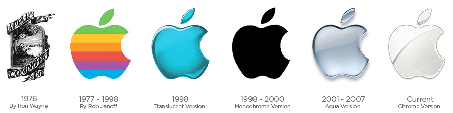
People may wonder how an apple has anything to do with the Iphone and a company focused on technology. After researching the history of the company I found out that the Apple logo actually fits the brand perfectly. But first, let’s go back to the first logo the company had.
Ronald Wayne was co founder of Apple computer co in 1970 and created the first company logo. Back then Isac Newton represented the brand. He revolutionized science with his discovery of gravity. And how did he discover this? Yes, an apple fell on his head! Now you probably understand the connection more. Apple’s first logo was Isac Newton sitting under an apple tree as you can see below.
When Steve Jobs took over he thought the logo was too old fashioned for the company. That’s when he hired graphic designer Rob Janoff who created the world-renowed logo of the bitten apple. As you can understand they took a part of the first concept and what it represented, but minimalized it to a more modern look. When they first created the Apple logo it was filled with a rainbow color. Steve Jobs wanted this because he thought this would «humanize» the company more.
After having that logo for a while they wanted to change it again to make it more suitable and elegant for all colors. So with that in mind they changed the color to grey with a metallic look. The new logo created a «glass» theme and it was the next evolution for the logo. Today it’s more flat in the color and you can mainly see the logo in three colors. (black, white, grey)
It’s a new week and a set of brand new learning activities! One of these new assignments was to learn more about understanding brand positioning. After reading about it in our logo design workbook, it was time to explain the position of three well known logos in the industry today. The Instagram, Mercedes and Mastercard logo. Here’s what I think!
“Positioning is the act of designing the company’s offering and image to occupy a distinctive place in the mind of the target market”.
Instagram
The founders of Instagram, Kevin Systrom and Mike Krieger didn’t make the purpose of their app to be featuring photos. In fact, Instagram startet out with the name «Burbn» and was launched as an app with check in and a social geo-location. The app did have other features as well, including the ability to quickly upload photos.
They quickly realized that the photo feature on their app was what people used the most and decided to pivot their concept to make their app better. They changed the name as well to Instagram to represent how the brand allows the user to make «Instant telegrams» That’s when Instagram started to arose.
Instagrams slogan and the meaning behind the brand is «Capture and share the worlds moments» If you go on Instagram right now, that’s exactly what your going to see. There are pictures from places all over the world featuring different cultures, religions, sceneries, and everything else you can imagine. Today you can use instagram for your own personal inspiration or you can market your buisness on the platform. Instagram has positioned themselves as a creative platform where people can express themselves and share everything and anything.
The founders of instagram wanted the consumer to be able to communicate through pictures. On Instagram you can express yourself, share pictures of your hobbies and passions. Even a picture of your cat so the world can see. Instagram has connected people around the world, making it easier to travel as well. Now you don’t have to go there to see the culture you’re curious about. Everything is a click away. Instagram wants people to get connected through communicating through pictures and having people express themselves proudly. Instagram has also started different hashtags to feature important topics like #Untoldpride for the LBGTQ community.
The Instagram brand logo is a symbol and a trademark for the company. There is no use of words and the symbol of the logo speaks for itself. The logo consists of a symbol of a camera, which is perfect for this worldwide picture based platform. They updated their logo years ago and added these fresh bright colors to their logo as well. This was a good way to make it stand out more and it fits to their audience since they have a lot of young people using their app. Today the Instagram logo is known worldwide and is very recognizable when people see it.
Mercedes-Benz
The Mercedes-Benz has it’s origins to the Daimler-motoren-Gesellschaft’s 1901 Mercedes and Karl Benz’s 1886 Benz Patent-Motorwagen. This was regarded as the first ever gasoline powered automobile. The Mercedes-Benz first appeared in 1926 under Daimler-Benz. Today the company is known for it’s luxury vehicles, buses, coaches and vans.
In 2018 the company was the biggest selling premium vehicle brand in the world having sold over 2.31 million passenger cars. Mercedes-Benz has a slogan that goes like this «The best or nothing» This shows how the company has positioned themselves as the best and only giving the best to their consumers. They position themselves as luxurious and trustworthy when it comes to the quality of their products. Their cars are for all different kinds of people out there, even if you want a luxury sports car or a nice passenger car or truck for the family.
Mercedes-Benz has sold a lot of cars and feature a lot of different cars as well so there’s something for everyone. The company has sports cars, passenger cars, electric cars, vans, trucks and busses as well. The company has also emerged in the making of electric cars and opening that possibility for their consumers. Mercedes-Benz now has six factories making electric cars for their consumers and is a tough competetor against the Tesla.
I would say the Mercedes-Benz logo is a trademark with it’s three pointed star symbol in their logo. The star symbolizes Gottlieb Daimlers aims for the universal motorization: on land, water and in the sky. They’ve had several logos through the years, but the logo they have today is their strongest one. All around the globe it’s easily recognized when seen in public. When people see it they know exactly who it was made by and the company it belongs to. The three pointed star symbol is iconic for Mercedes-Benz. The symbol says it all and represents the company without having to include their name.
Mastercard
Mastercard was originally called «Interbank» and later on «Master Charge» The company had a real boost in 1969 but they didn’t change their name before in 1979, ten years later. Today the company describes themselves as a technology company in the global payment buisness. Their aim is to use technology and data driven insights to make the electronic payment easier, more convenient, secure and effecient for everyone involved.
Now the company has a global reach in 210 countries and territories. They belive in a world with better ways to pay, a more connected world and a world beyond cash. The company position themselves to show the consumer that they want to make it easier and more convenient for when they are making payments.
I would say that the Mastercard logo we were assigned is a wordmark, since they display their whole name in the logo. This logo came in 2016 when the company wanted to reflect their readiness and optimism for the future. It was more simplified, modernized and optimized than the older one. This method of using a logo can make it easier for people to recognize the logo and connect it to the right company right away.
They also use a symbol in their logo of the two circles joining together. This can represent unity and coming together and meeting people half way to help them. Their new identity was meant to mark Mastercard as a forward thinking, human centered technology company. They wanted to be positioned as a company that connects people to priceless possibilities. In 2019 they took away the «mastercard» brand name under their iconic symbol. The interlocking red and yellow circles is now the only part of the Mastercard logo. The thought behind this was that when the time evolves their symbol still stays modern and flexible to the brand design optimized to work in the digital space.
This was the first of several learning assignments across the next two weeks. It was a nice little starting lesson but now it’s on to the next one, delving more into the process behind logo making. Cheers!
LA: You are briefed to do an illustration for fruit juice packaging (orange and banana flavour). The name of the product is: Loose Juice.
This weeks learning assignment gave me the first taste of drawing digitally and using illustrator. I have to admit that i’m pleasantly surprised. I met some obstacles along the way but it was a lot of fun making this label. The label is for Loose Juice, a fruit juice with orange and banana flavor. We had to include the label name, fruit and the flavors of the juice.
I wanted to make the design with fun colors and make it appealing for the buyers when they’re looking at it. When I think of fruit juice with different flavors I always think of something tropical. That’s why I illustrated a sun in the background and used warm, summer colors. I would say the design also gives of a farmers market vibe, which is the perfect place to sell some fantastic juice!
Another part of the assignment was to make 15 scamp sketches of the idea process for the label making and post it here as well. Here is how i sketched my way to the finished label design.
I started testing out different fonts for the label name in the design. I also started sketching out different ways to illustrate the fruits and different style leafs.
Then I started sketching different designs for the label that could be a possibility. As you can see I merged the two different designs down on the first page and really liked how it looked togheter. Having that design in mind I tested out different sun designs.
Here I tested out different banners for the bottom of the design and different ways to merge the two banners together.
After I was pretty happy with the choices I had made for the design, I started testing different color options for the different elements. I also tested the different options on the elements.
I tested the different colors on the banners and the suns as well. Then I sketched the whole design and tested how the colors looked together. I also wanted to test out a darker green on the design as well.
In the last sketch I sketched the whole design and traced it with a black marker as well. Then I took the colors I liked to most from the color testing and created the finished idea for the label.
That’s my process of how I created my Loose Juice label design. In the digital version I decided to make the colors a brighter, making the design more fun and lively. I think it made the design much better and more pleasing to look at as well. I really enjoyed this assignment and i’m looking forward to the next one.
The closure principle is probably the one i found the most intruiging and i was really exciting to try to make a design using this technique. I found extremely many genius and clever designs when i was researching closure. Because of this there was a lot of inspiration thrown my way and a it became a little overwhelming because I wanted to come up with something clever and meaningful as well. Here is one of the designs that inspired me.
From: Dribbble.com
I really liked the closure designs that just used one color and made the background show the rest. The eye naturally make the background part of the rest and you can see the whole image. This type of design is what i had in mind when i was brainstorming ideas.
I wanted to create something with a message and something clever as well. Something simple but at the same time got the point across. I’m passionate about the climate and how important it is that we take care of nature and the earth for future generations. This summer the tempratures have been extremely high and dangerous for peoples health. Something I also was thinking about in my idea was the amazona’s rainforest being on fire and how the earth is struggling to maintain all of our emissions.
As you can see in the design I only used black and let the background create the illusion of the rest. I created the world and showed all the countries. Around the earth i made a huge fire to represent the fact that the world is heating up drastically. When i was creating the world countries and the shape of the earth I looked up the world map online and choose the position i wanted it on the paper and drew it on there.
This idea came to me suddenly in the evening after i’d been to a climate meeting for interested teens and young adults in town. Because of this my mindset was set on climate change and how the world is doing. When i got the idea i went and get my sketch book and started sketching out the idea i had in mind. I tested out different versions of the sketch but was happy with the first design concept i came up with. As you can see the sketch i did is a quick and an easy sample of the finished design. You can also see another design idea that was a dead end.
I wanted to use black as the main color because it really stands out and makes a good contrast to this design principle. I made the fire around the earth bigger than the earth itself to show how the earth is defensless against the fire and can’t stop it. It shows how the fire has taken control over the earth and has the upper hand. I like that the design is really simple in itself but has a strong meaning behind it that i think comes across really well. I wanted all the focus to be on the main piece so i didn’t include any other color or element in my design because of this. I wanted it to be more of a simple statement piece that’s strong in itself.
This
assignment was a lot of fun and a lot of work as well. It taught me
much more about different design techniques and how there’s a lot
of different ways to creating a design then i was aware of. Now i
look at designs with a new found curiosity and interest in how they
made the design and trying to see the prosses behind it. An
assignment filled with lessons and inspirations for future projects
as well. Forever learning new ways to be creative and coming up with
designs and new ideas.
The second design principle I wanted to make was the regularity principle. The regularity principle was a method i figured out i wanted to use early on because i’m really fond of patterns and how they look. This made me really excited, but coming up with the design I wanted to make wasn’t that easy in the beginning.The second design principle I wanted to make was the regularity principle.
I had different concept and ideas going on in my brainstorming period. I was thinking about the possibilities of making a leaf pattern representing that autumn is coming soon, something i love. I really liked the nature aspect of the designs so i was also considering my possibilities when it came to an ocean design. The design i ended up with represents the ocean as well but not in the literal sense that i was thinking in the beginning.
My two earlier designs have a connection to nature and earth, so i thought it would be nice to have a little red line through them all. With that in mind i started thinking about different ideas involving nature in some kind. I really like watching documentaries about the ocean and all the wonders it contains. Whales especially fascinate me so much. So I chose whales as my subject in this piece and wanted to create a design with them in it. Having this as my fondation I looked at different whales and focused on how i wanted the design to flow in the piece.
by: Henry Rivers
The illustration of the big whale shark with the diver really caught my attention. Whale sharks are very beautiful with their dark color and all the white lines and circles on their back. They also move very gracefully in the water so i wanted them to flow through the piece in a smooth motion. This is what i used my sketching session to do before starting on the main design.
In
this design i also decided to keep the colors to a minimum making the
whales stand out and balancing the design out since there’s a lot
going on in this piece as well. I also think it makes all of my
pieces stand together very well and it makes that red line connecting
them even stronger.