This design is 1/3 of the two week main assignment i’ve been working on. In this assignment we had to research different design principles, understand them and then choose three we want to make ourselves. This was a great way to learn about different design techniques and being more aware of what we’re doing when making designs.
One of the design principles I chose was symmetry. I thought there were a lot of interesting designs and options to get inspired from. The first thing that came to mind when i was thinking about this principle was geometric shapes, that reflect each other and create a nice symmetry. This was my initial thought when i picked this principle and I was thinking about using that in my design. But as i was researching and looking at different examples of symmetry designs, I saw this particular design that inspired my new idea. One of the design principles I chose was symmetry. I thought there were a lot of interesting designs and options to get inspired from.
By: Bailey Sullivan
Having this idea in mind, i was looking outside and thinking what i could use for my piece and how to create it. This summer i’ve seen a lot of dragonflies around in the garden. I’ve always found them very interesting and unique in the way they’re built. That’s when i decided that i wanted to use the dragonfly as my subject and use it in my symmetri design.
I was contemplating about filling it with color and making it more colorful, but decided to keep it simple to better show the symmetry and not take away the attention from the principle. There is already a lot going on without it so i thought it would be better without any other distractions.
I wanted the dragonfly to fill the paper and have a lot of elements and patterns along the body. Since there is a lot going on in the body of the dragonfly i decided to put a bold line in the middle separating the two sides. This made the two separate sides stand out more and making the symmetry more noticable. I wanted to have lines, circles, triangles and mostly basic shapes in the body and wings. I also wanted there to be a lot of details and it having a mirror effect to the other side. I wanted the dragonfly to fill the paper and have a lot of elements and patterns along the body. Since there is a lot going on in the body of the dragonfly i decided to put a bold line in the middle separating the two sides. This made the two separate sides stand out more and making the symmetry more noticable.
This assignment is pretty much a copy of the teaspoon task, only with a new object. The assignment goes:
You have to design packaging for rice. The packaging has to be different from what is in the market. Apply each one of the SCAMPER techniques and do a write-up on your findings. Then choose the option that you think would work the best and do a sketch of what the packaging would look like.
The rice packaging design I came up with has a clean simple look and a new, fun outer design.
The design I came up with has a fun, clean package design that I haven’t seen in stores before. The small boxes inside are one person portions each, something i’ve missed having as options on the market.
Here is how i used the SCAMPER method for the rice packaging:
Substitute: I changed the portion sizes and made each box have one person portions.
Combine: I combined the packaging with transparent windows in to the product so you can see the quality.
Adapt: I adapted the design of the packaging and made it more clean and fun, hiding the info about the product on the back.
Modify/magnify: I made the package as a long, short rectangle instead of the ususal upwards packaging already on the market.
Put to other use: You can use the packaging again as a cute container for something else.
Eliminate: I eliminated the big family sized portions so it’s more convenient for people who live alone making dinner.
Reverse/rearrange: I changed the usual form of the package and made a new design that’s fun and fresh.
One of this weeks learning assignments was about problemsolving, being practical and creative. The assignment goes: You are given a teaspoon as an object. Now apply each one of the SCAMPER techniques to it and give a brief explanation of what new product comes out of this and how it can be marketed.
I found this assignment a little difficult in the beginning. Having a preconceived idea of the object made it hard to get past the barrier to changing it. Using the SCAMPER model helped a lot to make the ideas flow and make a finished idea.
If you’re wondering SCAMPER stands for:
Substitute
Combine
Modify/Magnify
Put to other use
Eliminate
Reverse/Rearrange
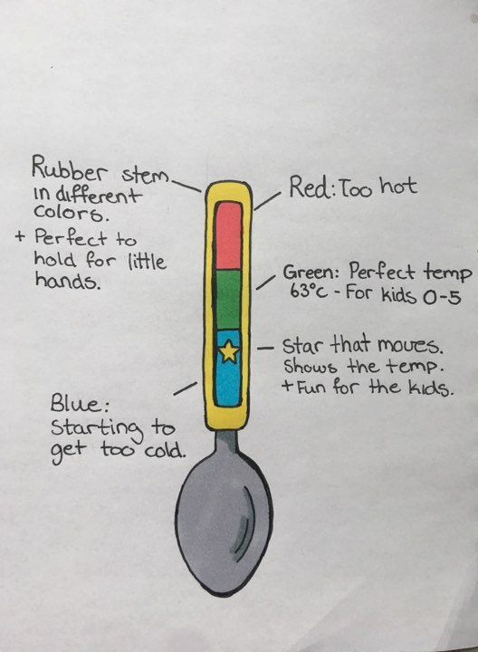
Using this model I adapted the spoon and created a new product from it. I had several ideas but I decided to keep the idea to make a spoon with a termometer in the stem. My audience target is mainly parents and children. This spoon is perfect for parents with children in the age range 0-5 years old. The spoon shows the temprature of the food the children are about to eat and makes sure it’s the right temprature for them.
The spoon has a rubber stem that comes in different colors and makes it fun for the kids. The rubber also makes it easy for little hands to grab it. The star on the termometer moves and shows the temprature with what color it’s on. The termometer is easily color cordinated to show the temprature. If the star is on red, the food is too hot. If it’s on blue the food is starting to get too cold, and when it’s on green it’s the perfect temprature between 63-65 degrees for children and babies.
Going through the SCAMPER model this is how i used it on my product:
Substitute: I changed the stem of the spoon to rubber material and placed a termometer on the inside.
Combined: I combined the spoon with the termometer making it convenient and practical especially for parents.
Adapt: I adapted the spoon and gave it two purposes. You can eat with it normally and see the temprature of the food you are eating.
Magnify/Modify: I made the spoon multifunctional and added fun colors and a gold star that moves to make it more kid friendly and fun for the user.
Put to other use: The other way you can use the spoon now is taking the temprature and using it for the comfort of your children.
Eliminate: I eliminated the steel stem and simplified the design of the termometer.
Reverse/Rearrange: You can use the spoon the way you would like. Rearranging the colors and using bright ones is eye catching and the children can learn the colors as well while eating.
McDonalds has evolved and changed with the tide since 1948 when it first started. Today there is a McDonalds in over 100 countries all around the world. Over so many years a lot has been added and changed in the fast food chain and what’s made them succesfull.
One of this weeks learning assignments was to use the internet to research the history of the fast food chain McDonalds and explain which part of the Scamper model that is evident in their development into their current success. After researching this is what i’ve found out.
Substitute:
McDonalds has changed and made the fast food buisness even easier. By eliminating waitresses and installing self service counters in their restaurants they saved money and made it easier for customers as well.
Combine:
In the 70’s McDonalds combined the usual burger and fries with a toy and created the happy meal. This has been a huge success with children especially and made the restaurant even better for families.
Adapt:
McDonalds has met some critisism through the years, especially associated with obesity and the enviroment as well. The fast food chain then adapted to the complaints and added healthy items to their menu, the vegan burger, no supersized portions and has gone over to paper straws instead of plastic.
Modify:
They modified themselves when they made the first drive through. Many years ago the military wasn’t allowed to leave their vehicle in their uniforms. To solve this problem and keep that customer group happy, they made the first drive through.
Magnify:
McDonalds has magnified their buisness when they’ve added more items to their menu that has become items that define McDonalds today. This includes the Big Mac, Egg McMuffin, Happy meals and Chicken McNuggets.
Put to other use:
They made a simple thing like a loving gesture a payment under the superbowl in 2015. Random customers who ordered at certain times would be able to pay for their meal with a loving gesture instead of money. «Your total is one big family hug» and «Call your mom and tell her you love her» was things the servers said to pay with.
Eliminate:
Mcdonalds simplified the burger chain very much. It was a lot cheaper and the service a lot faster because they used heat lamps to keep the ready food warm for customers. This way they could make the food before the rush houres and the food would be ready when the customers came.
Reverse/rearrange:
McDonalds have added and still bring new items to their menu to make it the best for their customers. Since their beginning and until today they have added desserts, healthy items, combos, side dishes and breakfast items so it’s something for everything you’re craving.
A man is replacing a wheel on his car, when he accidentally drops the four nuts used to hold the wheel on the car. They fall into a drain, irretrievably lost. A passing girl offers him a solution that enables him to drive home. What is it?
Considering that the girl don’t have anything else than advise to give him she would tell him to take one nut from each of the other wheels and use it on the last wheel. That way all the wheels have three nuts each.
Riddle 2
Two russians walk down a street in Moscow. One russian is the father of the other Russian’s son. How are they related?
I tried some of the practice riddles we got linked before doing this task. In the practice riddles I almost got tricked the same way as on this riddle. It was so easy for the brain to just assume that the people in the riddles are guys, when in reality they can be woman too. In this case the other russian is the mother of the son.
Riddle 3
What occurs once in June, once in july and twice in August?
I found a solution pretty quickly for this riddle. The answer is the u.
Riddle 4
Six drinking glasses stand in a row, with the first three full of water and the next three empty. By handling and moving only one glass at a time, how can you arrange the six glasses so that no full glass stands next to another full glass, and no empty glass stands next to another empty glass? What is the minimum number of moves to solve this puzzle?
I came to the conclusion that you only need one move to solve this puzzle. If you take glass number two and pour the water in glass number five you can then put the glass back in place and get that result
Another learning activity to get to know the website was to update our profiles. Here is mine!
We’re a lot of students all over the country so it can be hard to get connected in the start. To make it easier we had a learning activity where we had to introduce ourselves and write a little bit about who we are. This way it’s easier for us to get connected and know who’s behind the other computer screen. We also had to link our reflective journals so we can see each others artwork and inspire each other.
Assignment: Choose a metaphor/concept/analogy that illustrates how you see Moodle with all its different elements and areas. Use a pencil and paper to draw this.
The
task in this assignment was to choose a metaphor/analogy that fits
how you see the student platform moodle as
of today. This
was a totally new way of thinking for me, and that made me have to
think creatively. Imagening the platform as a real object made it
easier to get some ideas.
Looking
at the site and going through it for the first time made me
immediately think of a maze. I went through different ideas,
considering versions of maps, getting the information in, but i ended
up sticking with the maze in the end. During my brainstorming i was
always thinking how moodle feels for the students, therefor I
consider them my audience target. I wanted to convey the feeling of a
fresh new student going through the platform and figuering everything
out.
Creative
methods:
The
idea of drawing a website as a metaphor or an analogy was totally new
to me, so in the beginning it was a challange to get the ideas going.
During my brainstorming i tried to imagine the website more as a
physical thing or a
place and that sparked
some new ideas and made the creativity flow. I went through different
ideas, considering different kinds of maps, maybe a street of some
sort, but i ended up with my first idea, a maze. Through
the whole maze i wanted to put the different signs from the website.
After
deciding on the concept and the basic
idea
of it, I went to
pinterest and looked up different styles of mazes and labyrinths to
get inspiration before starting the drawing. The
first thing I did was to draw
the maze before starting on the signs from the websites. I choose the
placements of the different signs and decided to mainly
use the signs on the side of the website.
Here
are the the different artworks that inspired me in this assigment.
Sketches:
In
the beginning of my brainstorming i was avaluating different ideas.
Being a totally new type of assignment for me i had to interpret it
in various ways. At first i was thinking of doing it more as a map,
but I didn’t really get any more out of that. Then i started
thinking of the website as a place instead and got more ideas. I was
imagening going through the website as a street. I was seeing
different signs and objects as you move through the street. Another
idea was looking at it as a corridor or a hallway. This turned out
quite similar as the street just different looking perspectives. The
idea of the maze was the first idea that popped into my head because,
that represented how it felt on the website for the first time the
most. In the end thats the idea I ended up evolving and making the
finished drawing.
Here
are some of the other ideas, little sketches and dead ends.
Concept:
Being
a new student can be exciting and overwhelming at the same time.
Figuring out moodle for the first time can be challenging for many
new students and it can take time to know where all the pages lead.
That’s the thought behind my concept. The moodle maze represents
how it feels going through the website for freshly new visitor. Just
like in a maze, you can get lost, meet a dead end and end up where
you started. But when you finally have gone through all the passages
and found the middle you know the whole maze. This can be said about
the website as well. After you’ve gone through the different signs
and pages, in the end you know the website.
Design:
I
decided to put the different signs from the website along the walls
and floors of the maze because it represent how you have to go
through it and figure everything out before you reach the middle. In
the middle I put the moodle logo because thats the main goal.
Understanding and knowing moodle as a platform. When you get to the
middle (moodle logo) you know the platform and can use it properly. I
chose to the walls of the maze to be straight and clean so it looked
more organized and pleasing to the eye. Moodle is organized as well
but can be confusing the first time you enter. Just like this maze.
Colors:
I decided to use the colors of the website since thats the place I
was recreating. The yellow/orange walls represent moodle and the logo
color. The red floors represent noroff and the colors you see for the
most part when you are on the website. The white tops of the maze is
also from the noroff colors. I wanted to make the maze feel as much
as the website as possible, so i decided to keep the signs going
through the maze black, like they are on the left collum on the
website. I liked using more viberant colors instead of just greys, to
get the feeling og excitment. It’s very exciting being a new
student and all the possibilities ahead so I wanted to bright colors
to represent that.
It
was a very exciting assignment to do and i had a lot of fun with the
concept. I hope other students can relate to my concept of the maze
and the first feeling of using the website and figuring it out. It
was a great start to open my mind to thinking creatively and outside
of the box in a new way.
Refrence:
All
the pictures of the maze artworks can be found on the moodboard.
Assignment: Create a self portrait but it can’t be a photograph. For this assignment we had to get creative to recreate ourselves, so I decided to draw a cartoon version of myself.
Hi! i’m Kristin and I come from a little fjord called Beisfjord, up north in Norway. Some people may say living in my little village is boring but, I think a better word for it is peaceful. Very, very peaceful. It’s where i’ve lived all my life and i’ve become accustomed to a life of serenity here in the fjord. Living here has giving me a lot of time to grow. Time for interests to grow, passions to grow and dreams to grow.
I’ve always loved expressing myself through an artistic way. Drawing, writing and music has been my main hobbies all through life. The idea of living and doing any of that as a job is something i dreamed could be a possibility. It made me very excited but most of all, extremely inspired.
In school my music interest blossomed and every art assignment was something i looked forward to. Through my school years I sang solo’s, joined a band and when highschool came around, I took music as my main subject. After high school i took a diploma year and studied music production and songwriting in Sandefjord. Although I loved songwriting and singing, this is when i figured out that music wasn’t the career path I wanted to go.
I’ve always said that if i had to choose again I would go for studying art earlier in school. But the passion for being creative and drawing was always with me and in the back of my mind. So here i am today ready to finally begin using my passion for art in my degree.
I’ve chosen to study graphic design because I think it has extremely many options and opportunities especially because of social media. In today’s society it’s all about being relevant and putting yourself out there to gain attention. This can apply for companies, buisnesses, entrepeneurs etc and can be very important for getting your message out there. People need websites, posters, apps, book covers and a lot more. There’s a lot of opportunities and a lot of different exciting projects to be made. That’s what makes graphic design so special. It can be so much more than you think.
That’s why I’ve chosen to study graphic design and want to work as a graphic designer. In the future I hope to have the opportunity to do just that and work passionately creating designs for others. So I’m very excited and ready to work hard to see where this journey takes me.
Hi, I’m Kristin and I’m a 20 year old graphic design student in Norway. I come from a little fjord up north in Norway and am now studying online. I’ve always loved expressing myself in an artistic way like music, writing and art. It is my passion to be creative every day and this seems to be the perfect way for me to do that.
This reflective journal is a part of my studies where I’m going to post my progress and different assignments. I’m excited to connect to different artists and see their work and learn from others. Let’s let our wild minds be free, be creative, learn from our mistakes and become even better in the end.